Learning Data Science, Day 6 – Correlation
Today is mostly going to be taking an old Mac Mini I bought off of eBay and seeing if I can run Plex or Jellyfin on it (I'm hoping for Jellyfin, but it really depends on what I get when I turn it on), but, first! Correlation! Let's connect things and say that's what caused them!
Correlation
A mathematical function can use the relationship between two variables to make a prediction. To go back to my books and bookshelves analogy, if I have five empty shelves that hold 100 books each and each bag at the discount bookshop holds 50 books, then I can use the number of empty shelves to predict how many bags I'm going to purchase.
Correlation Coefficient
The correlation coefficient measures the relationship between the two variables. There's a hard rule to this coefficient though. It can never be less than -1 or higher than 1.
If it's -1, there's a perfect negative linear relationship between the variables.
If it's 0, there's no linear relationship.
If it's 1, there's a perfect linear relationship.
Or, basically, does graph go down, go up, or go everywhere.
They have examples, and this is where my movie data falls right down, because it's only two points, and when I plot the data on my graph...
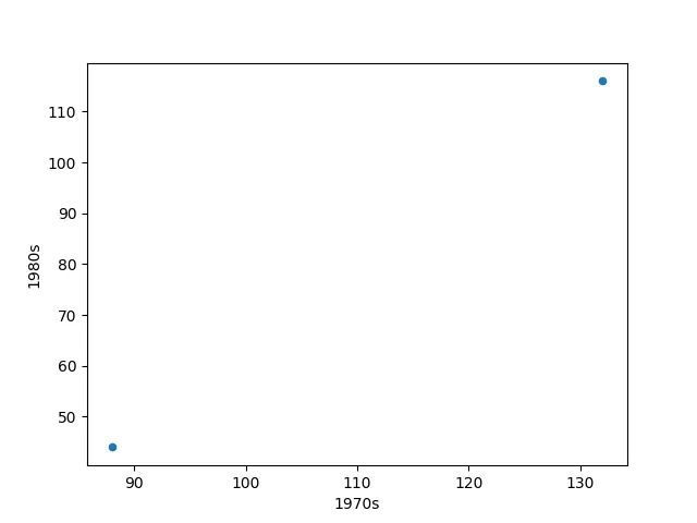
Those two dots tell me nothing.
So...fine...we'll use the health data they're using as an example. Fine, we'll use Average_Pulse and Calorie_Burnage. Fine, you have 10 points of data for each so you get a better graph. Fine fine fine.
This is the data they use:
| Duration | Average_Pulse | Max_Pulse | Calorie_Burnage | Hours_Work | Hours_Sleep |
|---|---|---|---|---|---|
| 30 | 80 | 120 | 240 | 10 | 7 |
| 45 | 85 | 120 | 250 | 10 | 7 |
| 45 | 90 | 130 | 260 | 8 | 7 |
| 60 | 95 | 130 | 270 | 8 | 7 |
| 60 | 100 | 140 | 280 | 0 | 7 |
| 60 | 105 | 140 | 290 | 7 | 8 |
| 60 | 110 | 145 | 300 | 7 | 8 |
| 45 | 115 | 145 | 310 | 8 | 8 |
| 60 | 120 | 150 | 320 | 0 | 8 |
| 45 | 125 | 150 | 330 | 8 | 8 |
And they use a scatterplot graph to show off the perfect linear relationship, which involves importing Pandas to read the CSV and the MatPlotLib to create the graph.
So first they have the lines to make the compiler draw.
import sys
import matplotlib
matplotlib.use('Agg')
Then they bring in Pandas and MatPlotLIb.
import pandas as pd
import matplotlib.pyplot as plt
Then we read the health data using Pandas.
health_data = pd.read_csv("data.csv", header=0, sep=",")
Graph out the health data for Average Pulse and Calorie Burnage using a scatterplot graph and MatPlotLib and print that.
health_data.plot(x ='Average_Pulse', y='Calorie_Burnage', kind='scatter'),

plt.show()
With two more lines to make their compiler properly draw.
plt.savefig(sys.stdout.buffer)
sys.stdout.flush()
(I'm not sure if you need those compiler-related bits of code if you're doing it all yourself on your system, but, eh, I guess it's trial and error.)
This does give us a very nice little scatterplot graph.
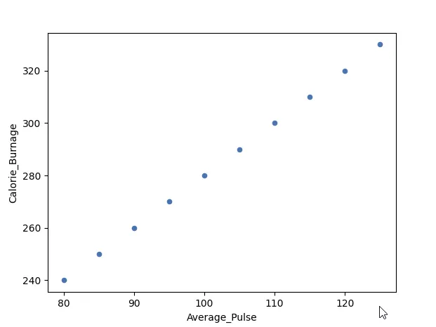
Which shows a perfect linear relationship. Look at that little graph go up!
They then show a negative linear relationship by tweaking the Hours_Work data, setting it to show that the less you work, the more you can work out, and therefore the more calories you burn.
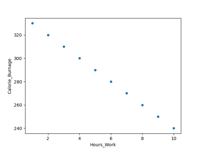
And if you take two data columns that you know have no correlation, you get no linear relationship, and it looks like its name – a scattering of points.
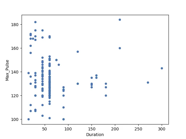
But it seems to me that you have to know that these things will correlate before you graph them? Like do you keep on matching up data in the vague attempt to get it to do that nice line?
Trying new data
Okay, I'm trying new data and seeing if I can get this figured out.
I'm going to pick something that would make more sense with correlation. I sadly can't just export it out, but, what the hell, I'm kinda curious.
We have Fuck Yeah Coelacanths!. We have a month of data. This data tells us the day, the number of notes, the number of new followers, and the number of existing followers.
So I want to know if the number of followers going up matches with the number of notes.
(Sadly, I can't get number of reblogs or likes as separate items. But it's still a start.)
This will give me a table with four columns and 30 rows, from 05/08 to 02/09 (I can only work with what they give me.).
| Date | Notes | New | Existing |
|---|---|---|---|
| 0508 | 110 | 1 | 18313 |
| 0608 | 202 | 1 | 18314 |
| 0708 | 116 | 1 | 18315 |
| 0808 | 116 | 1 | 18316 |
| 0908 | 150 | 2 | 18318 |
| 1008 | 134 | 0 | 18318 |
| 1108 | 160 | 0 | 18318 |
| 1208 | 285 | 1 | 18319 |
| 1308 | 250 | 1 | 18320 |
| 1408 | 207 | 2 | 18322 |
| 1508 | 133 | 0 | 18322 |
| 1608 | 105 | 1 | 18323 |
| 1708 | 107 | 1 | 18324 |
| 1808 | 126 | 1 | 18325 |
| 1908 | 144 | 0 | 18325 |
| 2008 | 90 | 1 | 18326 |
| 2108 | 99 | 3 | 18329 |
| 2208 | 190 | 0 | 18329 |
| 2308 | 1390 | 5 | 18334 |
| 2408 | 791 | 6 | 18340 |
| 2508 | 288 | 1 | 18341 |
| 2608 | 427 | 1 | 18342 |
| 2708 | 384 | 2 | 18344 |
| 2808 | 223 | 1 | 18345 |
| 2908 | 118 | 2 | 18347 |
| 3008 | 308 | 1 | 18348 |
| 3109 | 208 | 1 | 18349 |
| 0109 | 138 | 1 | 18350 |
| 0209 | 214 | 0 | 18350 |
So, okay, using .plot(x = 'Notes', y = 'New', kind = 'scatter'), let's see if the number of notes and the number of new followers correlates.
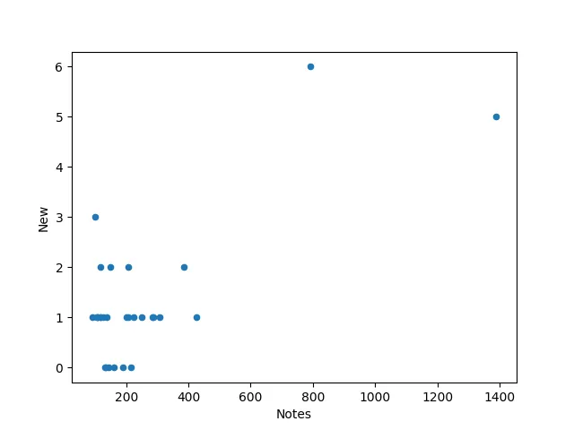
And they don't.
So let's go with one that probably does – the number of new followers and the number of existing followers.
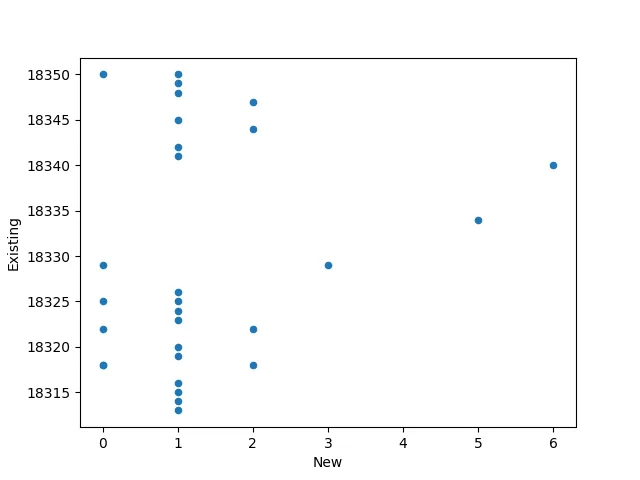
Huh. This one doesn't either. I guess it's because the number of new followers isn't a steady increase.
However, the date and existing followers does. Kinda. I suppose it's not a correlation coefficient of 1, so it doesn't count that the graph goes up.
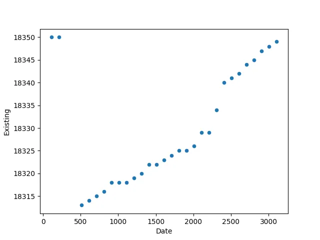
So there's no direct correlation between the number of notes, the number of new followers, or the number of existing followers. It's very Tumblr – it doesn't follow a linear path.
Correlation Matrix
A matrix is an array of numbers arranged in rows and columns.
So it's a table.
A correlation matrix is simply a table showing the correlation coefficients between variables.
Yep. Table.
But oooh, now I can make a Coelacanth Correlation Matrix. That sounds fancy. And it just uses Pandas and .corr()
import pandas as pd
coelacanth_data = pd.read_csv("data.csv", header = 0, sep = ",")
C_C_M = round(coelacanth_data.corr(),2)
print(C_C_M)
I like that it has round() in it, because keeping it at only two decimal points is nice.
When I print that...
          Date  Notes   New  Existing
Date      1.00   0.31  0.31      0.55
Notes     0.31   1.00  0.74      0.27
New       0.31   0.74  1.00      0.19
Existing  0.55   0.27  0.19      1.00
Boom. My correlation coefficients for each against each other. I now know that Notes and New have a higher correlation than New and Existing, which is just darn neat.
Correlation Heat-map
Ooh, now we're getting fancy with our graphs. We can use a heat-map to show it off. This would mean that the closer the coefficient is to 1 or -1, the closer to a particular colour it gets.
For this we use the Seaborn library, which is based on MatPlotLib.
Now, annoyingly, the Try It Yourself doesn't have the bit where you can paste in your own CSV. Nor does it let you run it.
I'm guessing that's because Seaborn would eat up a lot of processing power. And I don't really want to spend a lot of time tinkering around with my current hosting in order to see what my coelacanth data would look like in a heat-map, so I'll just go through the code explaining what it does, but we don't get to see the results...unfortunately.
First they import in Pandas, MatPlotLib, and Seaborn.
import pandas as pd
import matplotlib.pyplot as plt
import seaborn as sns
Then they read the CSV and create a correlation matrix.
full_health_data = pd.read_csv("dataset.csv", header=0, sep=",")
correlation_full_health = full_health_data.corr()
Then they make a .heatmap() with correlated data, and the rest is just the designy bits.
axis_corr = sns.heatmap(
correlation_full_health,
vmin=-1, vmax=1, center=0,
cmap=sns.diverging_palette(50, 500, n=500),
square=True
)

plt.show()
So vmin and vmax define the minimum and maximal values of the heat-map, with center showing the centre of it. .diverging_palette() defines the colours, and n=500 is the types of gradient in the colour palette. square=True means that you want it in squares.
I wonder what the other colours are. And what other shapes you can have. I have a feeling this is Graphviz levels of complexity, so I'm not going to touch it right now. At least, for now. I mean, I like making graphs do things, so I will come back to it.
Correlation vs Causality
They want to remind you that just because there's a high correlation, that doesn't mean one variable is responsible for the other.
They have an example about how during the summer, the sale of ice cream and the number of drownings increase, but you can't say that more ice cream causes more drownings.
They actually put all of this into Python to show you that the correlation coefficient is 1, but that you shouldn't use this data to prove that ice cream causes drowning.
It would be funnier if it was ice cream versus shark attacks, because then I could spend all day making Jaws jokes.
More ice cream means more shark attacks means more nattily-dressed mayors telling you there are no sharks and Amity Island welcomes you.
Day 6 — Results
- The relationship between two variables is a correlation.
- The correlation coefficient measures the relationship between the variables.
- It can never be less than -1 (negative linear relationship) or greater than 1 (perfect linear relationship). If it's 0, there's no relationship.
- It will be decimal-points in-between, so you want it either closer to -1 or 1.
- You plot scatter plot graphs using MatPlotLIb and
.plot( x = 'DATA1', y = 'DATA2', kind = 'scatter'). - A correlation matrix shows the coefficients between all the variables in a nice neat table.
- You do this using Pandas and
.corr(). - You can also round it up by using
round(DATA.corr(),DECIMALPOINTS). - You can also make a correlation heat map using Seaborn and
.heatmap(DATA, vmin = MINIMUM, vmax = MAXIMUM, center = CENTRE). - You indicate the colour and the level of gradient in the heatmap by adding into
.heatmap()this:cmap = SEABORNNAME.diverging_palette(COLOUR, COLOUR, n = GRADIENT), SHAPE = True) - Correlation does not equal causation.
- Buying more ice cream does not cause more shark attacks.
- Coelacanths are rad.
Today's Sticker

I was briefly considering a shark sticker I had, because I was too busy making Jaws jokes in my mind, but, let's be honest. Today is definitely a coelacanth day.
I got this dude from Svenrin Art Studio on Etsy, but, sadly, there are no more coelacanths available on there. Oh well.
But I do have an entire collection on Etsy called Coelacanths I have found for Tumblr. Since I'm always looking for coelacanth content, Etsy has been quite the resource for me, and, y'know, if you ever felt the need to buy something coelacanth-related, here's your chance.
(But that's just stuff that's still listed on Etsy. The coelacanths on etsy tag on Fuck Yeah Coelacanths will have you astounded by the coelacanth merchandise people have made.)