Learning Statistics, Day 3 - The Key Features of Data and Frequency Tables
So we've gone through the basic information about statistics and now we're getting into what Descriptive Statistics are.
This is where we come up with graphs and other visual representations. Which will be nice. I do like making graphs. And maybe I can finally be able to read some of the more complicated graphs out there, because I sure do have a hard time with some of them.
Key Features of Data
Of course, before you can even draw the graph, you need to know exactly what data you're going to put on there. You can't put everything, then it'll be a mess, so you need key features.
- Location: Where are most of the values concentrated?
- Scale: How much variation is there within that centre?
- Shape: How does the data look when you map it out?
These are also known as summary statistics.
Location
This is also known as the centre of the data, or location parameters. It's where most of the values are concentrated. So, to go back to my Letterboxd data, most of the films I've watched were from the 2000s (394) and the 2010s (461), which would make those two decades the centre of my data.
Averages, like mean, median, and mode, also measure the centre.
Scale
The variation of the data is how spread out it is around the centre. This is where standard deviation, range, and quartiles come in to measure the variation, so I can put the scale parameters in place.
This would be how there's a 67 film difference between the 2000s and the 2010s, and a 137 film difference between the 1990s and the 2000s. If I included all the decades I've seen films from, the scale parameters would have to go from 3 (the 1910s) to 461 (the 2010s).
Shape
This is how the data fits, whether or not it's skewed to one side or the other. These shape parameters are important when designing your graph, so you know where to map things out right.
Since the 1910s (3) to the 1940s (74) are below 100, but the 1950s (157) to the 1980s (245) are definitely over 100, you can say the data skews slightly to the left of the centre.
Visualising Data
And once we know the key points of our data, we can then put it into a visual format.
There are a lot of different types of graphs, as any spreadsheet software will tell you:
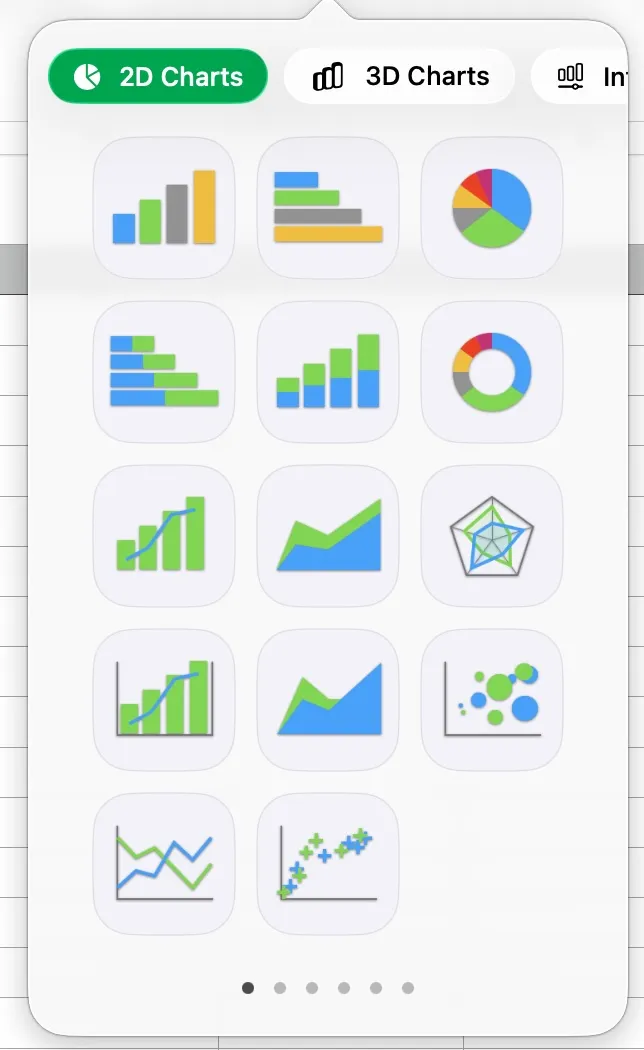
(This example is from Apple's Numbers.)
Some of the examples they give are:
- Pie Charts: Shows off qualitative data
- Histograms: Shows off quantitative data
- Scatter Plots: Shows off bivariate data
- Box Plots: Shows off quartiles
The course will get into more detail as we go on.
Frequency Tables
Frequency tables are a way to present data. You sort it into intervals, and then count the data and order it into those intervals. You can have very precise intervals, or very broad ones, depending on how many different values you have.
Like, if I were to take every film I watched, and then sort it into individual years, I'd have a lot of data for the 2010s, but then a lot of empty cells for the 1910s.
The 1910s would look like this:
| Year | Films |
|---|---|
| 1910 | 0 |
| 1911 | 0 |
| 1912 | 1 |
| 1913 | 1 |
| 1914 | 0 |
| 1915 | 0 |
| 1916 | 0 |
| 1917 | 0 |
| 1918 | 1 |
| 1919 | 0 |
And the 2010s would look like this:
| Year | Films |
|---|---|
| 2010 | 43 |
| 2011 | 51 |
| 2012 | 42 |
| 2013 | 50 |
| 2014 | 44 |
| 2015 | 41 |
| 2016 | 49 |
| 2017 | 53 |
| 2018 | 41 |
| 2019 | 47 |
Now imagine if I decided to have all the decades between the 1910s and the 2010s in there too. That would be such a huge table. It would be so annoying. We're not doing that. We're going to set the interval to be decades rather than individual years. SO MUCH BETTER.
| Decade | Films |
|---|---|
| 1910s | 3 |
| 1920s | 8 |
| 1930s | 29 |
| 1940s | 74 |
| 1950s | 157 |
| 1960s | 191 |
| 1970s | 205 |
| 1980s | 245 |
| 1990s | 257 |
| 2000s | 394 |
| 2010s | 461 |
(What's great is that Letterboxd does all the counting for me, so I just have to put it in a table and show it off.)
There's a note here about how the intervals are also called "bins", but I'm not going to call them that. Bins are what you put garbage in. I have learned to say this instead of "trash can". Don't make me have another definition for bins.
Relative Frequency Tables
So we know the numbers, but how many times do those numbers appear in the data compared to the total amount? If we did a percentage of the numbers based on the total (2024), that would be a relative frequency, and we can make a table of that.
| Decade | Relative Frequency |
|---|---|
| 1910s | 0.15% |
| 1920s | 0.40% |
| 1930s | 1.43% |
| 1940s | 3.66% |
| 1950s | 7.76% |
| 1960s | 9.44% |
| 1970s | 10.13% |
| 1980s | 12.10% |
| 1990s | 12.70% |
| 2000s | 19.47% |
| 2010s | 22.78% |
Cumulative Frequency
You can also see how your data counts up to a particular value. In this case, we can see how many films I've seen up to a particular decade.
| Decade | Cumulative Frequency |
|---|---|
| Before 1920 | 3 |
| Before 1930 | 11 |
| Before 1940 | 40 |
| Before 1950 | 114 |
| Before 1960 | 271 |
| Before 1970 | 462 |
| Before 1980 | 667 |
| Before 1990 | 912 |
| Before 2000 | 1169 |
| Before 2010 | 1563 |
| Before 2020 | 2024 |
We can then also have the cumulative frequency table turn into a relative frequency table, if we wanted.
| Decade | Relative Cumulative Frequency |
|---|---|
| Before 1920 | 0.15% |
| Before 1930 | 0.54% |
| Before 1940 | 1.98% |
| Before 1950 | 5.63% |
| Before 1960 | 13.39% |
| Before 1970 | 22.83% |
| Before 1980 | 32.95% |
| Before 1990 | 45.06% |
| Before 2000 | 57.76% |
| Before 2010 | 77.22% |
| Before 2020 | 100% |
Which is just darn neat. And all of these will come into good use later on when I start making graphs.
Day 3 — Results
- You need to know the location, scale, and shape of your data before you can start to describe it.
- The location parameters (or centre of data) are where most of the data is concentrated.
- Mean, median, and mode also indicate location parameters.
- The scale parameters (or variation) are how spread out the data is from the centre.
- Standard deviation, range, and quartiles also indicate scale parameters.
- Shape parameters are how the data fits and if it's skewed to one side or another.
- Frequency tables are how you can count your data, order it into intervals, and display it in a table.
- You can also have relative frequency tables, which count how many times the data appears in the total amount.
- Percentages are good relative frequency tables.
- You can also have cumulative frequency tables, which add up the data to a particular interval value.
- You can also do a relative cumulative frequency table.
Tomorrow I start with the actual graphs and charts. Oooh, excitement!
Today's Sticker

Club Shifty's Grinning Possum.
I'd say go buy more Club Shifty merch, but they're actually in the process of moving to a new print-on-demand retailer because Fourthwall decided to go for AI.
They're currently reviewing their options, but if you know of a good online print-on-demand resource that can do awesome t-shirts and stickers, let them know, because lord knows everyone (EVERYONE) needs their amazing t-shirts.