Learning Statistics, Day 6 – Variations
Boo, I just found out that my next module isn't "Information Management and Visualisation" but is, instead "Customer-led Disruption in a Digital Era".
Which is fine, I guess. I mean, the assignment at the end is a customer journey, which I can pretty much do in my sleep, and it looks like most of the reading is from business journals, which aren't really difficult reading, but, aw man, I wanted to spend time just making pretty graphs and charts.
Oh well. That's what Statistics is for, I guess.
Variation
So with the averages, we know what's happening in the centre of the data. But now we need to know what's happening around all the rest of the data set, and how spread out it really is. This is what Variation is all about – measuring how far away the values are from each other.
Like how the number of films I've seen from the 1910s is 3 and the number of films I've seen from the 2010s is 461. They are very far away from each other, and that is the Variation I have.
Variation can only be used on numerical data, because it involves doing maths.
The most commonly used ways to measure variation are:
- Range
- Quartiles and Percentiles
- Interquartile Range
- Standard Deviation
Range
Range is the simplest way to measure variation. It's just the difference between the smallest and largest values of data.
So, yeah, we take the 3 films and the 461 films, subtract the 3 from the 461, and my range is 458.
Of course, if we had a lot more data and we didn't have it organised by lowest to highest, we could use Python, NumPy, and .ptp() to do all this reaaalllly easily.
import numpy

values = [3, 8, 29, 74, 157, 191, 205, 245, 257, 394, 461]

x = numpy.ptp(values)

print(x)
And we get our 458 again.
Or we could use max() and min() in R to get it as well.
values <- c(3, 8, 29, 74, 157, 191, 205, 245, 257, 394, 461)

max(values) - min(values)
(Why don't we use range() in R? That returns the smallest and largest values in the data. Which is great to know, and you could do the subtraction yourself, but doing max() - min() does it just as well.)
Quartiles and Percentiles
Quartiles separate the data into four equal parts (quarters) and Percentiles separate the data into 100 equal parts (percents).
Quartiles are broken up into:
- Q0: The smallest value in the data
- Q1: The 25% value in the data
- Q2: The 50% value in the data, the Median
- Q3: The 75% value in the data
- Q4: The highest value in the data
If I take my decade film viewing data and turn it into a histogram (because I do like bar charts)
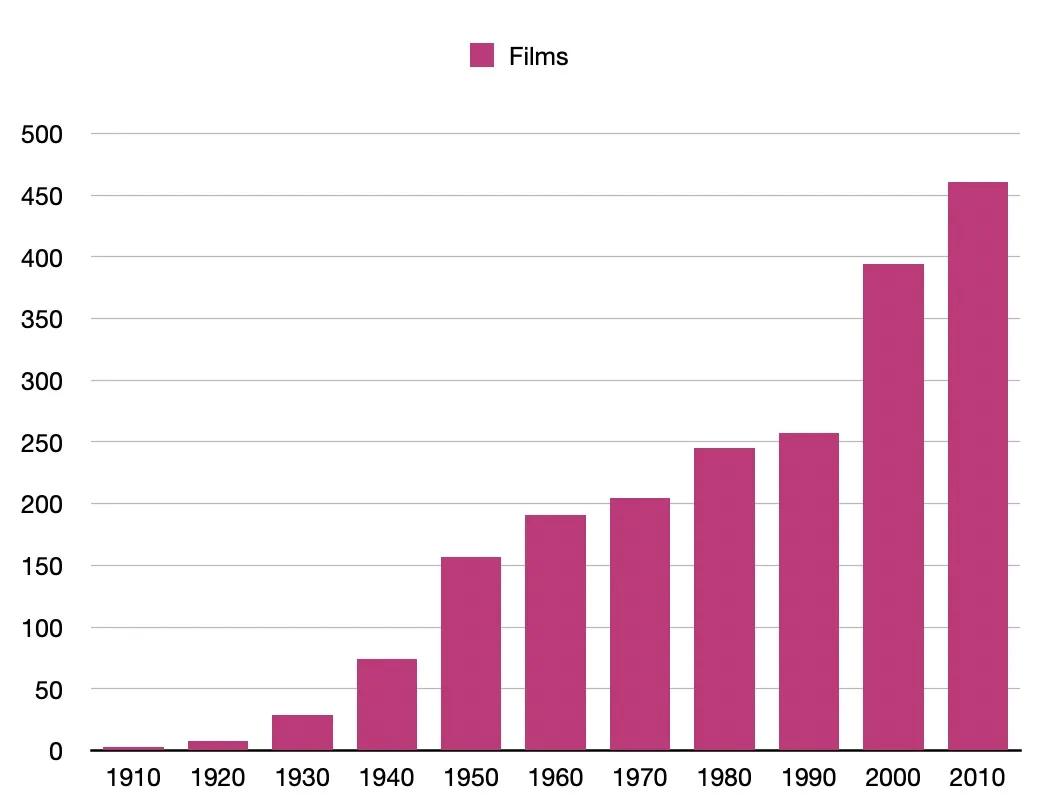
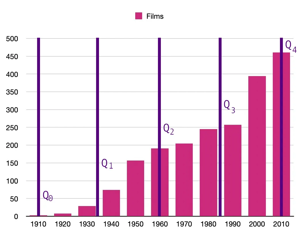
We know that our median is 191, because we learned that last week. Which means that our Q1 is between the smallest value (3) and the median (191). And since there are four values there, it'll have to be the mean between 29 and 74, which is 51.5. And the same applies for our Q3, which will be between 245 and 257, so that's 251.
So we can map out the quartiles on the histogram like this:
But, man, that's a lot of playing around with numbers, and even these tiny numbers gave me a headache. So let's throw them into Python, use quantile() and relax.
import numpy

values = [3, 8, 29, 74, 157, 191, 205, 245, 257, 394, 461]

x = numpy.quantile(values, [0,0.25,0.5,0.75,1])

print(x)
And we get
[ 3. 51.5 191. 251. 461. ]
Which, yep, matches up with the arithmetic I did.
R makes it even easier to read, with quantile():
values <- c(3, 8, 29, 74, 157, 191, 205, 245, 257, 394, 461)

quantile(values)
Which gives us
   0%   25%   50%   75%  100%
  3.0  51.5 191.0 251.0 461.0
Nice.
We can do this with Percentiles too. Like, sure, the Quartiles give us 25%, 50%, and 75%, because that's just basic maths, but what if you wanted to know, like, what's the top 5% in your data? Or 65%? Or 10%?
In Python, it's percentile():
import numpy

values = [3, 8, 29, 74, 157, 191, 205, 245, 257, 394, 461]

x = numpy.percentile(values, 95)
y = numpy.percentile(values, 65)
z = numpy.percentile(values, 10)

print(x)
print(y)
print(z)
And in R, it's quantile() again, but you include the percentage in with the values.
values <- c(3, 8, 29, 74, 157, 191, 205, 245, 257, 394, 461)

quantile(values, 0.95)
quantile(values, 0.65)
quantile(values, 0.10)
And now we know that that our top 5% (or lowest 95%) is 427.5, that our 65% is 225, and that our 10% is 8.
Interquartile Range
We can also track the space between Q1 and Q3, which is called the Interquartile Range.
So we subtract our 51.5 from our 251, and we get the range of 199.5.
Or we could use SciPy and .iqr() to make our lives easier.
from scipy import stats

values = [3, 8, 29, 74, 157, 191, 205, 245, 257, 394, 461]

x = stats.iqr(values)

print(x)
Or R and IQR().
values <- c(3, 8, 29, 74, 157, 191, 205, 245, 257, 394, 461)

IQR(values)
Both give us the 199.5 we got from doing the maths, but much faster than my tired brain.
(Also? I keep on just typing 1995 instead of 199.5. This is because I graduated high school in 1995, and I am very used to treating it as a year rather than any other form of number.)
Standard Deviation
Standard Deviation measures how far an observation is from the average of the data.
You use σ to indicate the Standard Deviation and μ to indicate the average.
There is a very fancy formula for this, which means I have to dig out the mathematical unicode again.
σ = √ ∑(𝑥₁ - μ)2 / 𝑛
That's for the whole population. There's another formula for the sample population.
𝑠 = √ ∑(𝑥₁ - x̄)2 / 𝑛 - 1
I am...not doing all that. My head hurts just trying to find the damn UTF-8 codes for all that.
Python can do it. That's what .std() is for. When I want to find the population standard deviation, I use
import numpy

values = [3, 8, 29, 74, 157, 191, 205, 245, 257, 394, 461]

x = numpy.std(values)

print(x)
And I get 144.90122027216898. We can round that up to 144.9. Nice.
And in R, it's a little more complicated, because you have to include some of the maths, but...
values <- c(3, 8, 29, 74, 157, 191, 205, 245, 257, 394, 461)

sqrt(mean((values-mean(values))^2))
In this case, it's subtracting the mean of the values from the values, taking that number to the power of 2, getting the mean of that, and then doing the square root of it.
Man, even explaining that makes my head hurt.
And the sample standard deviations are a bit weirder. In Python, you still use .std(), but it includes ddof=1.
import numpy

values = [3, 8, 29, 74, 157, 191, 205, 245, 257, 394, 461]

x = numpy.std(values, ddof=1)

print(x)
I had to look up what ddof=1 mean, and it's apparently "1 degree of freedom from the sample".
So then I had to look up "degree of freedom", and I got "how much freedom you have when selecting values".
But actually, a Statistics How To did make it make sense. "The maximum number of values that can be independently varied in a given sample". So while we can choose X number of samples from our data set, at some point, it's gonna have to be a specific number, otherwise we've run out. So we subtract 1 to save that number from the random selection.
Or something like that. I think I get it, but it's a tangent that I don't need to go on right now.
Anyways, Python returned 151.97368193210298.
R makes it even easier, it's just sd().
values <- c(3, 8, 29, 74, 157, 191, 205, 245, 257, 394, 461)

sd(values)
And I get 151.9737. Good.
Also apparently, if the values are within one standard deviation, they're typical, but if they're out three standard deviations, they're outliers.
So we know that my Standard Deviation from the Mean is 144.9, and we can put that in my histogram like so:
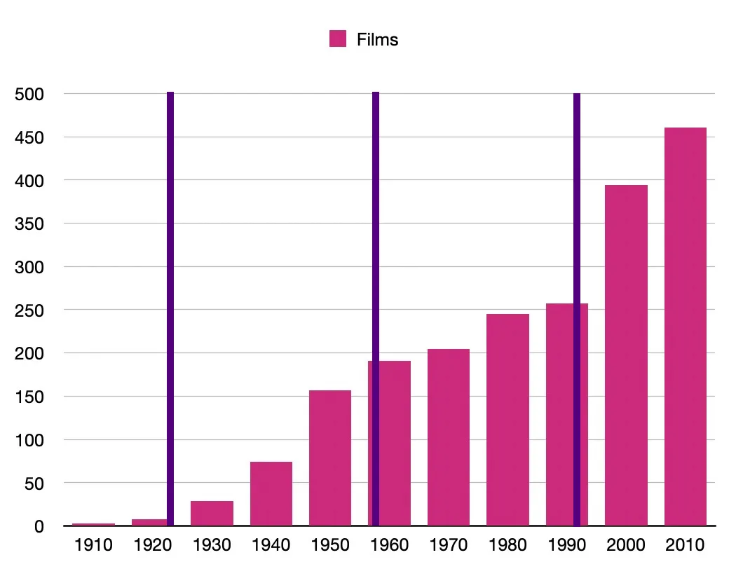
Or...something like that. I'm really getting quite the headache here.
Day 6 — Results
- Variation is about how far away values are from each other.
- You can check variation through Range, Quartiles, Percentiles, Interquartile Range, and Standard Deviation.
- Range is the difference between the smallest and largest values.
- In NumPy, you use
.ptp()to get the range. - In R, you use
max() - min()to get the range. - You can't use
range()in R, because that gives you the smallest and largest values in the data. - Quartiles divide up the data into four equal parts.
- Q0 is the smallest value in the data. Q1 is 25%, Q2 is 50% (the Median), Q3 is 75%, and Q4 is the largest value.
- You can use
.quantile()in NumPy orquantile()in R. - Percentiles divide up the data into 100 equal parts.
- In NumPy, you use
.percentile()like.percentile(DATA, PERCENTAGE), withPERCENTAGEbeing a whole number. - In R, it's
quantile()again, but you include the percentage in a decimal, likequantile(DATA, PERCENTAGE). - The Interquartile Range is the range between Q1 and Q3.
- In SciPy, you use
.iqrand in R, you useIQR(). - Standard Deviation measures how far an observation is from the average of the data.
- NumPy does Population Standard Deviation in
.std()which is nice and easy. - R does it with
sqrt(mean((DATA-mean(DATA))^2)). - NumPy also does Sample Standard Deviation, if you add
ddof=1, like.std(DATA, ddof=1). ddof=1is the degree of freedom from the sample.- R uses
sd(). No need for fancy maths.
Theoretically tomorrow, I could start on the Inferential Statistics, but I'm going down to London for the rest of the week starting on Wednesday, and then my new coursework module starts up on the Monday after that, so I'm not entirely sure when I can continue with statistics. Especially what with me still job hunting, and doing pilates once a week in the evening, and wanting to play Valheim all the time, and my coelacanths tumblr is sorely lacking in posts, and...
I mean, I'd like to do the inferential statistics, but it might have to wait a bit. We'll see.
Today's Sticker

It's a Jess Bradley sticker! And it's the illustration of a shark with a pencil that she has on her website!
I picked this up aaaaages ago when she used to do conventions. Maybe she still does, but she's probably too busy being awesome and illustrating awesome things. Buy her books! Delight in her illustrations! Everything is just neat!