Learning Web Development, Day 10 — Headers and Backgrounds
The sun's out, the laundry's on the line, I got around 7 hours of sleep last night, I'm feeling actually a bit cheerful, okay, let's take on this next terrible Bootstrap project, because it will have things I will likely see in the future, and I need to know how to tell people to not do that.
02 — Bootstrap Project 2
In this project, it's apparently building an online store, which, like I said, will have stuff I will inevitably see in the future if my next position involves any sort of online marketing for any sort of online business. It's just what happens.
Even when you're not actively selling a physical product, you're still making product pods, building a shopping basket, all that sort of thing.
And being that I have a penchant for looking at source code and going "What. What is this. Why is this there. Do you realise what this is doing to our SEO. Have you even thought about our design guidelines. What."
Well...
Yeah, I should know how people make these sorts of things.
01 — Product Page Project Setup
"This is going to be a scrolling website, just like the previous project. Scrolling is a good idea for a website, because it is more user-friendly, in that users don't have to click around, they can just scroll. This will also tend to keep them on the page longer, because there's that scrolling effect."
Oh, honey, I'm gonna have to disagree there. I don't ever want checkout on the same page. I want to see my basket, I want to consider my decision, and then I want to purchase. Even if I'm doing my usual impulse shopping, I'm gonna need to see more there.
But, okay, single-page website with a product and a checkout. Fine.
The instructor also said we could copy/paste the navigation and footer from the previous project, which, actually, I like. Yeah, if it's the same thing, copy/paste all you want. Ain't no need to remake the wheel. And those were the two bits that were proper semantic HTML, so I already love them.
And in this, we have <header> as well. I like using proper HTML sections. It's nice. It keeps things organised. You don't have to explain what something is. It just exists.
They're also doing a CSS reset, which is pretty good. And they introduced the idea of how to set up the margins and padding across all four points, the whole margin: 0 auto 0 0; or whatever. Which I love seeing, because that's a nice little trick.
So this is what we're starting with. I'm leaving out the <head> and all the links to the Bootstrap CDN, because, really, you don't need to see the full page. Just what we'll be working in:
<header>
</header>
<div class="pricing-header">
</div>
<div class="container">
</div>
<div id="checkout">
</div>
With the CSS of:
html,
body {
 width: 100%;
 height: 100%;
 margin: 0 auto;
 background-color: black;
 color: white;
}
p {
 color: white;
}
It could be simpler, but, eh, right now, it's not too bad.
02 — Build A Product Header
I don't really like the whole "put in an image and have an overlay <div> over it" thing, but I also know that it's a pain to adjust all your background images to be background-friendly, so, okay, I'm down.
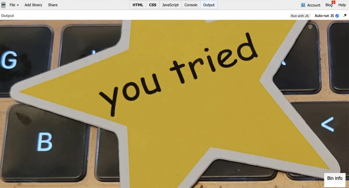
And since I decided to use my "You Tried" sticker for my background in here, I guess it makes sense, because I'm not bothering to open GIMP to change the contrast and darkness, then uploading the image somewhere else, and then pasting that link into JSBin.
I really like how we're doing all the header and image work in actual CSS rather than just some random Bootstrap classes. I can actually see what's happening and where things are going. And it's reminding me of CSS I haven't used in, like, shoot, 20 years?
Like...yeah, it must have been around 2005/2006 when I found out what z-index was and started using it. I was working at this crappy little web agency based in Nottingham, and the designer kept on coming up with weird little add-ins to put onto the page, mostly thinking in terms of what could be done with <table>s and the like, and I was putting it all into CSS and really getting funky with it.
I remember doing z-index to add little cables that went between the main product <div>s and the background. That was neat.
This is my <header> now:
<header>
	<div class="overlay">
	</div>
	<img src="https://bear-images.sfo2.cdn.digitaloceanspaces.
	com/katemonkey/20260402_143444.webp">
	<div class="container h-100">
		<div class="d-flex h-100 text-center
		align-items-center">
			<div class="w-100">
				<h1 class="display-3">Unlimited Online
				Courses</h1>
				<p class="lead mb-0">Watch anywhere. Advance
				your career. You tried.</p>
				<p><a href="#checkout" class="btn btn-primary
				my-5 px-4 py-2">Enroll now ></a></p>
			</div>
		</div>
	</div>
</header>
And this is my CSS:
header {
  position: relative;
  background-color: black;
  height: 100%;
  min-height: 25rem;
  width: 100%;
  overflow: hidden;
}
header img {
  position: absolute;
  top: 50%;
  left: 50%;
  min-width: 100%;
  min-height: 100%;
  width: auto;
  height: auto;
  z-index: 0;

  -ms-transform: translatex(-50%) translatey(-50%);
  -webkit-transform: translatex(-50%) translatey(-50%);
  -moz-transform: translatex(-50%) translatey(-50%);
  transform: translatex(-50%) translatey(-50%);
}
One thing I don't get, and please correct me if I'm misunderstanding, but if you're setting the top and left to 50%, and then doing translatex and translatey to -50%, aren't you just putting everything back to 0?
I mean, it looks great right now, it's a great big "You Tried" star that is remaining static on the page and not letting you see anything else.
But I'm going to see what happens if you remove the top/left and all the transforms...
Huh.
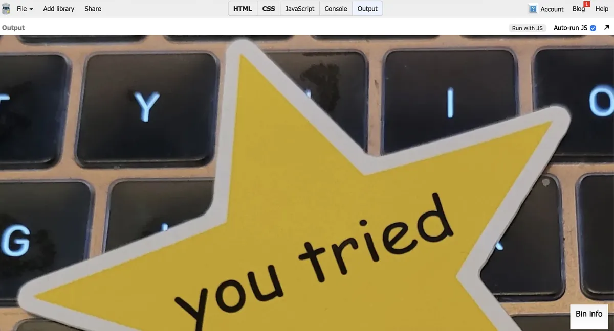
Is this really all that different? I mean, okay, yeah, it's from the top of the image, not the middle, but eh...
Leaving in the top/left without the transforms does move it over to the middle of the screen, like it obviously would, being 50% in each direction, but I don't get how including the transforms makes it go all the way to 0 on the left and to, like, what, -25% on the top?
Weird. I need to look into this further.
03 — Add Elements Onto Background Image
Woo-hoo, just more CSS. And most of it is pretty straightforward and gives me everything as it should be:

And the CSS is pretty straightforward too.
header .container {
  position: relative;
  z-index: 2;
}
header .overlay {
  position: absolute;
  top: 0;
  left: 0;
  height: 100%;
  width: 100%;
  background-color: black;
  opacity: 0.7;
  z-index: 1;
}
h1 {
  color: white;
}
The overlay div is a little annoying to me, not because of its code, which is pretty good.
But its existence kinda bugs me. Couldn't I theoretically put all that on the container div for the text?
And I could, but then the opacity hits the text as well, which is not helpful. Not to mention the weird margins.
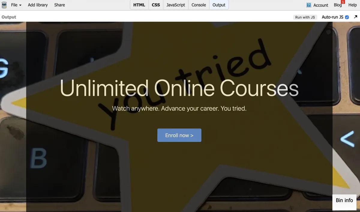
It looks neat, but, no. No.
I will say, I now understand why there is actually a text-weight-bold class in Bootstrap, but I am deeply annoyed that it exists. Why on earth am I just bringing back something you took out of my H tags? Why would you do this to me?
Day 10 — Results
<header>,<nav>,<section>, and<footer>are sexy and everyone should use them.position: relativeon a header makes it move around as needed.position: absoluteon the image inside the header makes it stay put inside of that.- Putting
top: 50%andleft: 50%and thentransform: translatex(-50%) translatey(-50%)puts your image firmly in the center of your<header>. - Don't forget to add in all your browser-related special code, like
-ms-transformand-webkit-transformbecause browsers are assholes. z-indexis still kinda neat.opacityis pretty groovy and I totally need to play with it more.
I really liked this today because it was entirely CSS-driven, with a minimum of unfucking Bootstrap's code. Still too many <div>s to my liking, but getting to play with all the CSS options out there to make something nice...I like that. I like that a lot.
Tomorrow is making the pricing and basket. Which I might end up liking a little less, but who knows? I could be entirely surprised and get even more delicious CSS. We'll see.
Today's Sticker

Appa is giving you all the love in the world.
(I got this sticker ages ago from Orly & Fitz, a site that is no longer active. Which is sad, because they had Appa with little pride hearts, and I'd love to have them everywhere.)