Learning Web Development, Day 2 — Style Your First Website
After a brief break for sheer laziness (and discovering that there was a 50x50 Connections puzzle that needed to be solved), I am back on my web development coursework.
I actually applied what I learned to my main site, putting in the viewport and charset. I need to do some slight tweaking to the CSS now, but, hey, isn't that what this day is going to teach me?
01 — Style Your First Website with CSS in 1 Hour
So help me god, if this ends up being nothing but <div>s, I'm flipping a table.
According to the (completely out of order again) table contents, this course will cover:
- CSS Project Preview
- Style The Header
- Style The Navigation Bar
- Style Website Sections
- Build A Sidebar
- Build A Responsive Layout
- Build Backup Styles For Older Browsers
As something of an older browser myself, I'm glad to hear there'll be some backup.
00 — CSS Project Preview
This is just explaining that the instructor is focusing on the site they made earlier, with the one big <div> and the images hotlinked from Pixabay.
I'm hoping to learn a bit more about modern CSS. My knowledge is still more or less in the mid-00s, with maybe a few more things added, but, yeah, mostly back then.
I picked up a few bits while I was working at Games Workshop as their studio web person, learning how to make it all behave and trying to get everyone else to also get involved. That was also when Adobe was like "You can take the XML from InDesign and turn it into websites" and I was way too excited about that, especially since the White Dwarf team was about to move from Quark and I was spending a lot of time just copy/pasting from buggy old Quark files.
When I quit that job, I was playing around with CSS a bit on my own sites, nothing too exciting, and then in 2004, I got a temp job as a designer for this weird little agency in Loughborough, where the main designer had broken his collarbone and they needed someone to work quickly on a website for what I think was, like, the National Sugar Beets Consortium or something like that. There were beets involved.
The agency was based in a converted chapel in the middle of a cemetery. That was freakin' awesome. And whoever that dude was, wherever you are now, you taught me so much about CSS just from your fantastic code files. And god_damn_ it was a good time.
So I picked up more over the years, but not too much. Once I ended up in Marketing instead of web design, I didn't actually have to know how to code, I just needed to know to point people to it. So I am waaaaay behind the times.
01 — Style the Header
This was the bit of the HTML I did like, with that lovely <h1>, so I'm hoping that the CSS is good.
I understand that the instructor wants to make sure that the student is linking to the right stylesheet in the right location, but they didn't have to say it has to be named style.css. It can be named aaaaaaanything as long as you put .css on there.
I also like that they're pointing out the difference between elements, ids, and classes. And pointing out that you can specify colours by hex code, RGB value, or name. I've only been using colour names as part of my need to build detailed Sims 4 family charts in GraphViz (more on that later, trust me) because I'm still a hex code kinda person.
I don't like that they're putting body after header in the CSS, though. That's just me being pedantic.
But, overall, the CSS for this first section? Not painful.
header {
	background: #DD571C;
	color: white;
	padding: 50px;
	text-align: center;
}
body {
	margin: 0;
	font-family: Arial, Helevetica, san-serif;
}
I wouldn't have necessarily gone for that orange and white combo, but, hey, whatever.
02 — Style The Navigation Bar
This bit of the HTML bugs the hell out of me, because they just put loose <a>s in a <div> and slapped an ID on it.
<div id="navigationBar">

	<a href="#top">Home</a>
	<a href="#codingFundamentals">Coding Fundamentals</a>
	<a href="#webDevelopment">Web Development</a>
	<a href="#appDevelopment">App Development</a>
	<a href="#pythonProgramming">Python Programming</a>
	<a href="#machineLearning">Machine Learning</a>
	<a href="#interviewPrep">Interview Prep</a>

</div>
So I'm a little concerned about what they're going to do CSS-wise.
They introduced the cascading part of the CSS, which is good, and they are focused on making sure the text/background contrast ratio is high, which is even better.
Ooh, actually, I have never heard of inline-block. Huh. That's a nice little trick. I need to figure out how I can use it with my nav. But dang, not having to float: left any more with a navigation bar? Sweeeeeeeeet.
And I suppose it helps to know how to set the nav to be sticky. It bugs me, but at least nothing is flying in and out (yet).
I still wish this was with a <ul> though. This is me being obstinate.
#navigationBar {
	background-color: #333333;
	position: sticky;
	top: 0;
}

#navigationBar a {
	color: white;
	text-decoration: none;
	display: inline-block;
	padding: 15px;
}
03 — Style Website Sections
Again with just the single <div> holding everything. Why not break it up a bit? Separate out the products! Come on!
And then naming the <div> pageContent. Camel Case always bugs me, and I find it awkward to read.
And showing the difference between px, %, and em is good. I didn't know about vh or vw (viewport-height and viewport-width, respectively). That might actually be what I need for pages. But then again, I do love just using %. I suppose I'll get into it when I get down to the Responsive Design section.
And I've actually not set responsive widths for images before. I don't know how much I'm going to use this for my knitting patterns, since the images are pretty small already, but, actually, I should figure that out, especially making sure they look good on phones.
And the instructor didn't do as much CSS design as I feared for this. That's pretty nice and basic.
.pageContent {
	padding: 1.5%;
}

img {
	width: 100%;
}
04 — Build A Sidebar
What are you doing why do you need a sidebar you already have the top menu...
I suppose, yeah, having a sidebar means you can teach people about positioning and the like, but, oh no, why are you putting a <div> in a <div>?
<div class="pageContent"

	<div class="sidebar>
		<h2>#1 Best Seller</h2>
	</div>
	<div class="main">
Noooo. (But at least they close the <div>s at the end)
But oh! Flexbox! And Grid! Hey, these are things I need to learn! And, okay, I guess I can live with these terrrrrrrible <div>s if you're teaching me Flexbox.
.pageContent {
	padding: 1.5%;
	display: flex;
}

.sidebar {
	flex: 30%;
	padding-right: 2%;
}

.main {
	flex: 70%;
}
Good god, why am I still using float like a mug? This is so much easier.
05 — Build A Responsive Layout
Okay, you better be showing something good, otherwise I'm just gonna spend all my time updating my website and making it use flex.
(Well, no, not today. That will be a project for tomorrow.)
I like that they're bringing up "mobile-first" as an option, but I've always seen that done very painfully, especially when you mostly use a site on a desktop. Soooo much white space. So little actual need.
Oh hey, @media. I remember that conference.
Mostly I've used media to focus on print stylesheets, because I like print stylesheets and I like letting people print out my stuff and have it look good, especially since I share my knitting patterns. I don't want to make them into PDFs, I want nice web pages that print out nicely too.
But I really should look into the max-width aspect. That is definitely something that will help me with some of my more random pages.
(And, hey, maybe one day I will make an AO3 skin that'll let me happily read on my phone while in bed without needing my glasses. Dim colours, big text, hidden menus...yesssss....)
I didn't know about flex-direction either. I like that too.
@media screen and (max-width: 700px) {
	#navigationBar {
		position: relative;
	}
	.pageContent {
		flex-direction: column;
	}
}
06 — Build Backup Styles For Older Browsers
Yeah, fuck it, I'm bringing in the meme.

Who needs Imgflip when you have Apple Preview and five minutes of boredom?
I really try to make sure that my sites are designed for ancient browsers. Hell, for a year and a half in the late 90s, I was mostly working off of an old Mac with a black-and-white portrait monitor that was a roommate's father's, and the only browser I could use was Lynx.
I still love Lynx. It was always a good time.
But I keep on forgetting that -ms- versions of CSS exist. I should probably put those in if I'm going to use flex.
.pageContent {
	padding: 1.5%;
	display: flex;
	display: -ms-flexbox;
}
.sidebar {
	-ms-flex: 30%;
	flex: 30%;
	padding-right: 2%;
}
Day 2 — Results
- Start considering using the colour names instead of the hex codes.
display: inline-blockgives you the vibes of a block, with the stackability of being inline.position: stickykeeps something on top the entire time. If that's your thing.width: 100%on images sets the images to the width of the screen on whatever device the viewer is using.display: flexreplacesfloatand makes everything better. SO MUCH BETTER.@media screen and (max-width: NUMBERpx)will change the CSS for anything that is smaller than the number specified inmax-width. This is good for phones.flex-directionis normallyrowbut you can switch it tocolumnso that your flexboxes line up on top of each other instead of side-to-side.- Don't forget to bring in your
-ms-versions if you're using more modern CSS.
Man, I really need to spend more time playing around with Flexbox. This honestly looks like it's going to make things so much better for my sites. I mean, they're still be awkward and clumsy, but that'll just be the writing, not the design.
I'm glad I learned more CSS. The next section is on animation, which will annoy me, just because I don't like it when things fly in and out, but maybe I'll be pleasantly surprised.
Today's Sticker
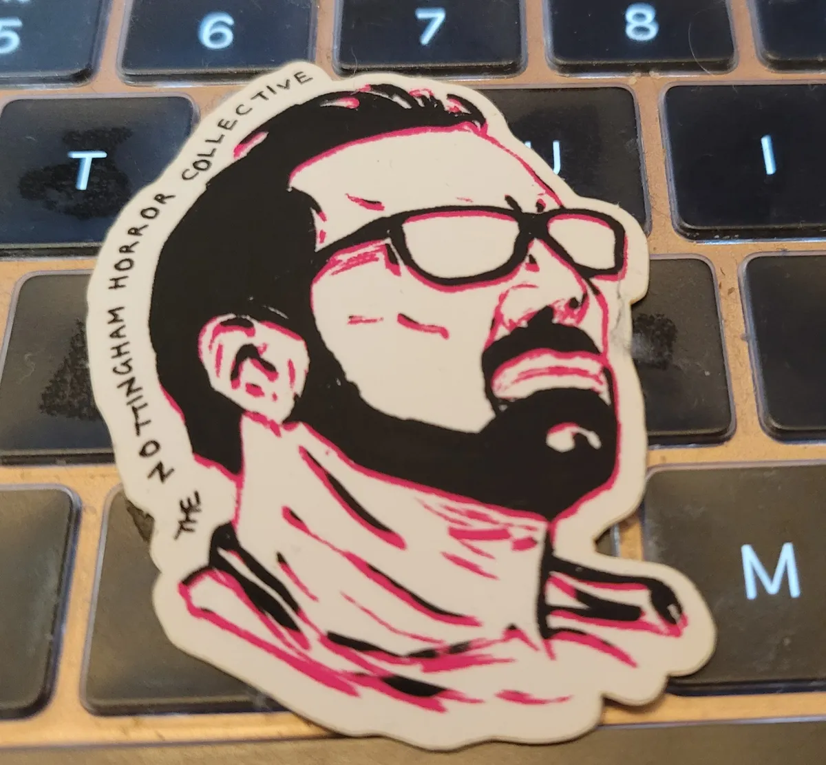
Nicholas Cage from the Nottingham Horror Collective. I have a pile of Nicholas Cage stickers from them, but I can't remember what most of them are referencing. At first I thought this was from Mom And Dad, but he doesn't have glasses in that, and then I thought it was Color Out Of Space, but he doesn't have a beard in that, so now...I don't know. Does he wear glasses in Mandy? I can't remember.
Anyways, enjoy Nicholas Cage. I always do.