Learning Statistics, Day 4 - Let's Make Graphs
Woo-hoo we're gonna make some graphs heck yeaaaaah let's go.
I'll be using the Letterboxd data I used yesterday, because I like it a lot better than the sample data W3Schools is using, which is "Age of Nobel Prize winners up to the year 2020".
It's...fine, I guess. But movies are more fun.
Histograms
I didn't know a histogram was different from a bar chart, but it apparently is, because it focuses on quantitative data.
It shows the number of times a value appeared in the data in set intervals.
The X-axis is the intervals, and the Y-axis is the frequency.
So if I take the Frequency Table I made yesterday, with the decades interval, and make a histogram, I get this:
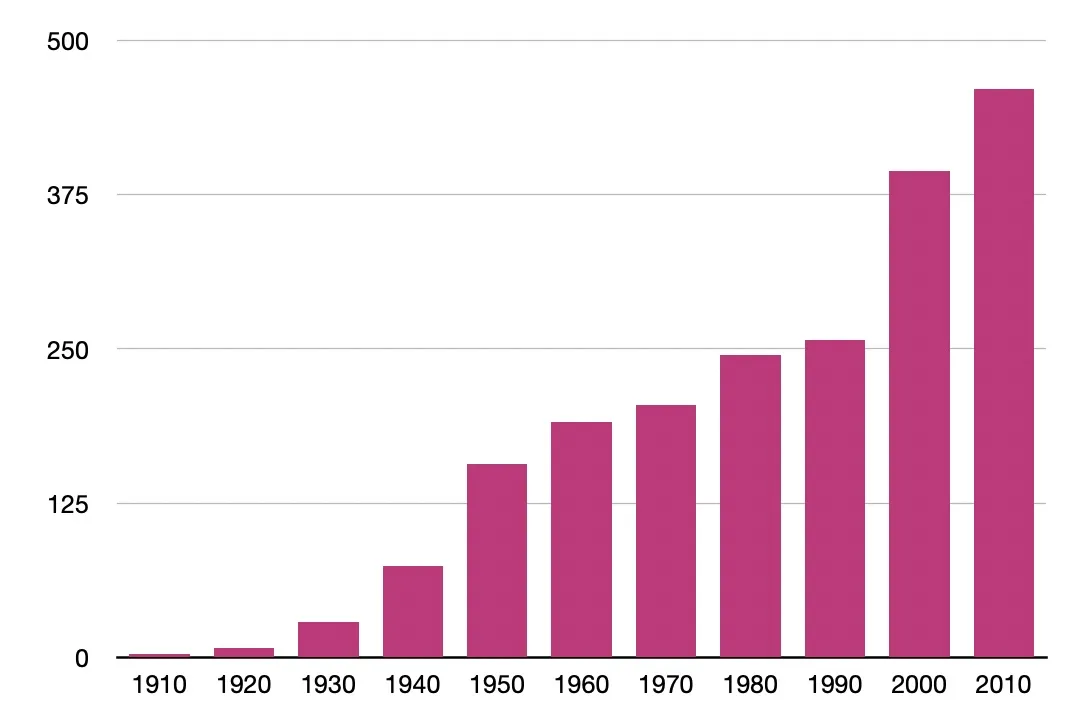
Which is a nice visual representative. Yes, I have seen more films from the 2010s than I have from the 1940s. Bar goes up.
The intervals are, again, called "bins", which I don't think I can do, but it's good to know. And they point out that you shouldn't make your intervals particularly short, because that could get really confusing really fast.
As an example, I'll do films I've seen by year from 2000 to 2026. That's 27 intervals.
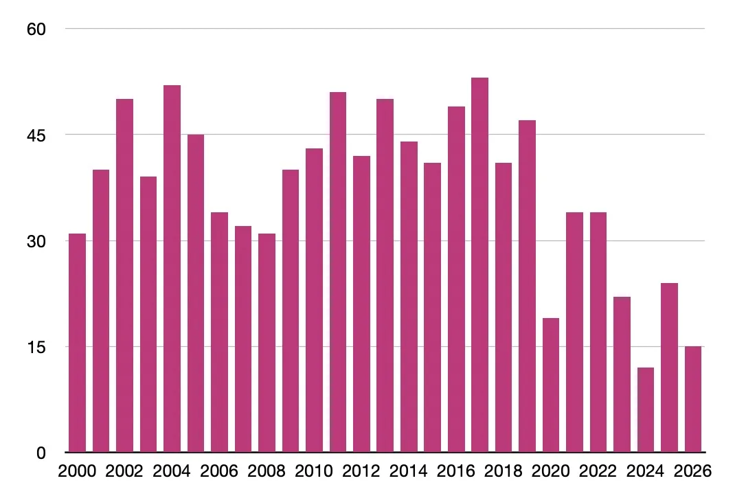
Yeaaaah that's a lot.
(Randomly, I discovered that both Excel and Numbers will not do your axes properly unless you actively indicate that one row and one column are headers. Google Sheets just does it, or lets you pick specific data for each axis, but noooo, the other two have to be special. How annoying.)
Bar Graphs
Bar Graphs are just like histograms, but they focus on qualitative data. It's the same frequency of values, but instead of intervals, it's categories.
So it's time to throw in some genres to evaluate.
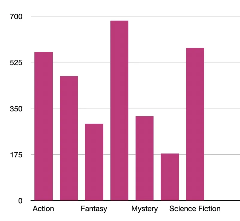
Because it's focused on genres, there are a lot of films that are in multiple genres. Like, Teenage Sex and Death at Camp Miasma is listed on Letterboxd as Comedy, Horror, and Romance. So it shows up three times in the graph above.
Pie Charts
Pie charts also focus on qualitative data, and show it in a circle. It's usually relative frequency of the values, because each percentage is a slice of the pie.
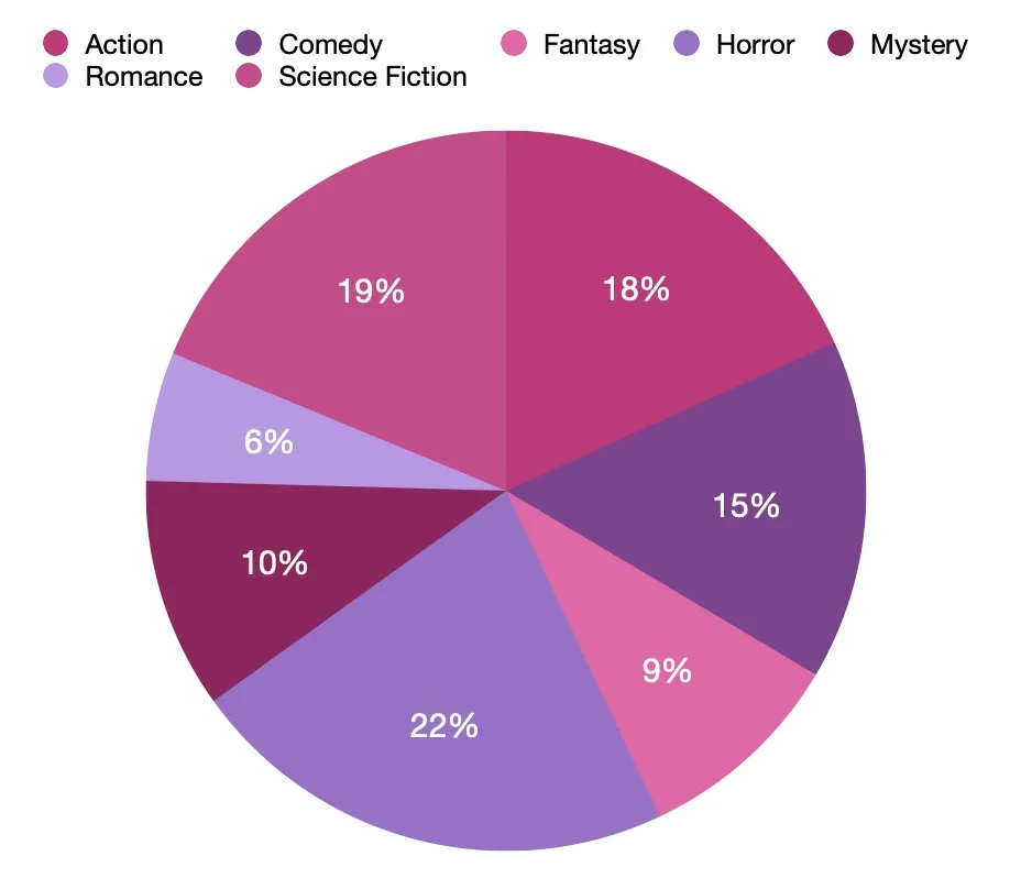
Yes, Horror and Science Fiction get the biggest pieces of the pie. They deserve all the pie in the world.
Box Plots
Box plots are for quantitative data and show off the key features of the data. It shows off the median, the range, and the quartiles.
They're also called "box and whiskers" plots, which is adorable.
Now, annoyingly, Numbers doesn't do Box Plots without you having to create some complicated image work. More recent versions of Excel do, but they set it up vertically instead of horizontally.
However, there's a Box Plot Calculator that'll do it for you if you just pop in your numbers. It's not as pretty as Numbers, but it'll do.
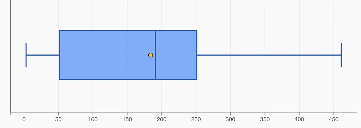
So the line in the middle of the box is the Median. That's the middle value of all the films I've seen – 191. The yellow dot next to it is the Mean. That's the average of all the films I've seen per decade – 184.
The left side of the box is the First Quartile. That's the value that separates out the first 25% of the data from the rest. In this case, it's 51.5.
The right side of the box is the Third Quartile, or the value that separates out 75% of the data. Here, it's 251.
The box itself is the Inter-Quartile Range, or IQR. This is where the "middle half" of all the values are – between 51.5 and 251.
The bits on either end – the whiskers, if you will – are the minimum and maximum values in the data. This is the Range. The Range here is between 3 and 461.
So I've seen on average 184 films per decade of release, with most of my films-per-decade being between 51 and 251 films. The least amount of films-per-decade I've seen is 3 and the most is 461, but the middle point is 191.
I think I like Box and Whiskers Plots. I could see it being very good for, like amount spent on advertising, or return on investment numbers, or things like that.
Day 4 — Results
- Histograms are bar charts that show quantitative data organised by intervals.
- Bar Graphs are bar charts that show qualitative data organised by categories.
- Pie Charts show qualitative data by frequency percentage.
- Box Plots show off the median, mean, quartiles, minimum, maximum, and range.
- If you want your Numbers or Excel to actually show you the right data, make sure you turn your first column into a header column.
- I've sure seen a lot of horror movies.
Although I dug into it a bit with the Box and Whiskers Plot, I'm going to get deeper into averages, means, medians, modes, and all that tomorrow. Alas, it's unlikely to have pretty graphs, but it will be filled with ridiculous film data.
Today's Sticker

Another Shifty Sticker Club delight. Do I know what it's from? No clue. But you know what it is?
Cute! Cute! Cute!